SWIG - Hard Lemonade Launch
Creative Strategy, Brand Identity, Packaging
Role: Brand Strategist, Lead Designer
'23
Project Overview
SWIG, an emerging beverage brand, set out to launch its first hard lemonade - a product meant to capture the spirit of summer relaxation. The goal was to create a brand identity that embodied good times, warm nights, and effortless enjoyment while establishing SWIG as a legitimate competitor in the crowded ready-to-drink space.
I was tasked in leading the creative direction and design. This included developing the logo, color system, typography, and packaging, as well as rendering a 3D can and building real-world mockups.
The Challenge
SWIG was preparing to launch its first-ever hard lemonade and they needed a presence. It had to stand out in a competitive packaged goods market while capturing the essence of summer relaxation. The brand had to feel like wavey beaches, sunset nights, and effortless good times with friends.
For me, it was also uncharted territory. I had never designed packaging before, let alone modeled a 3D can on blender.

The Approach
To ground the design, I first needed to define what “relaxation” and “summer enjoyment” actually looked like in visual terms. I started by breaking down the feeling SWIG wanted to evoke into tangible design elements. Consumers typically associate calm and leisure with soft color palettes - tones that feel approachable rather than bold or aggressive.
Typography played an equally important role: rounded, open letterforms signal ease, while sharp or rigid typefaces suggest formality or seriousness. I also explored shape and layout, finding that curved lines and flowing patterns mirrored the natural rhythm of waves and sunsets, tying directly back to the brand’s “summer nights with friends” positioning.
By mapping these associations, I created a design framework that ensured every visual choice pointed back to the core experience SWIG wanted people to feel when they picked up the product.
The Solution
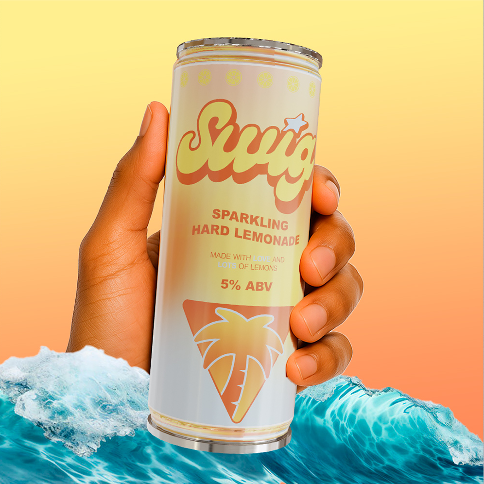
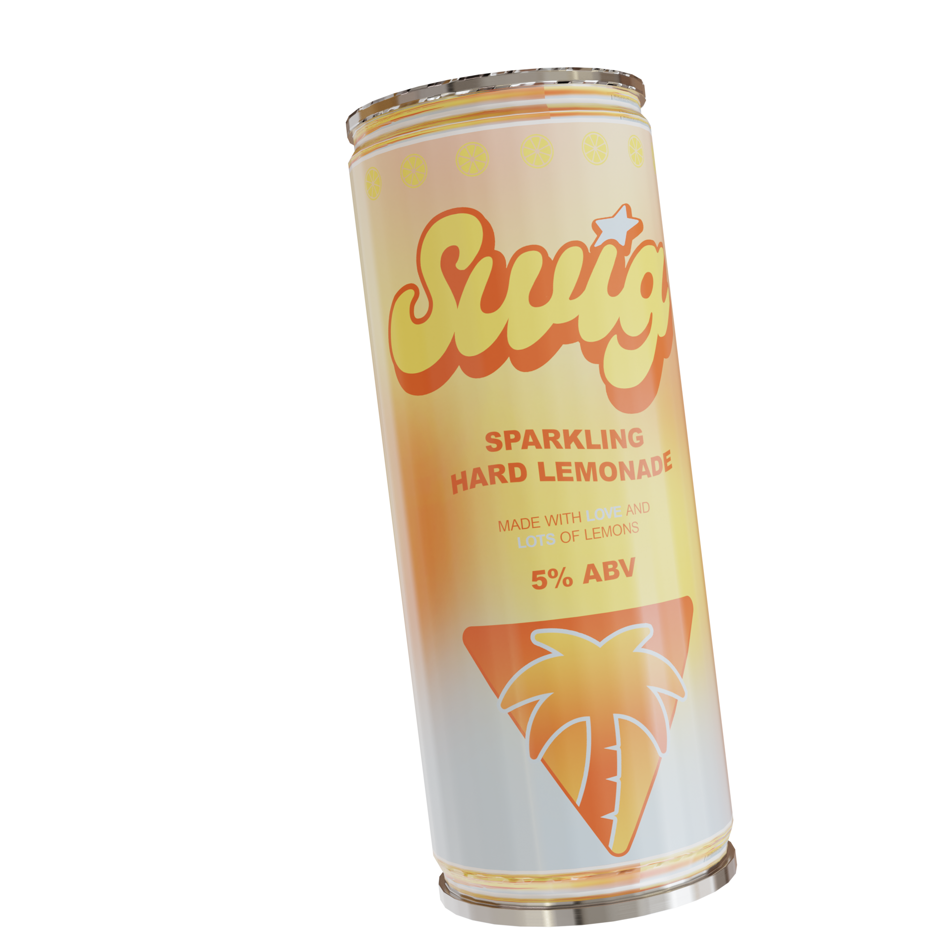
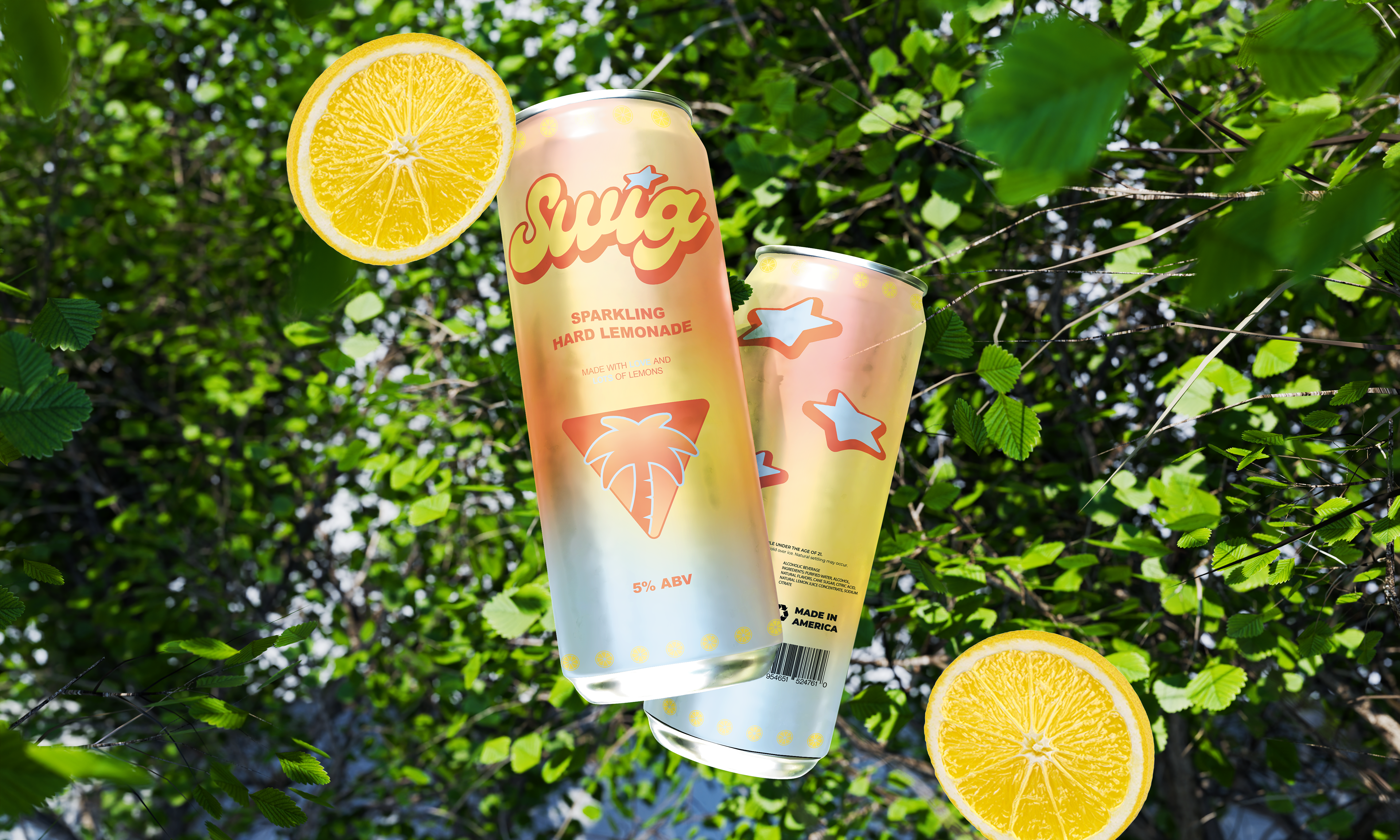
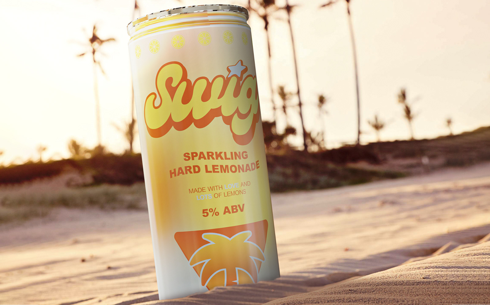
With the framework in place, I translated strategy into design choices across every element of the product. The logo was kept simple and groovy, built to be easily recognizable at a glance on a crowded store shelf. Its rounded forms tied directly to the relaxed, approachable feeling defined in the strategy. For the color palette, I chose soft gradients that shifted between warm oranges and light blues, echoing the tones of a sunny beach and of course, lemons; a direct reference to the summer days the brand wanted to capture.
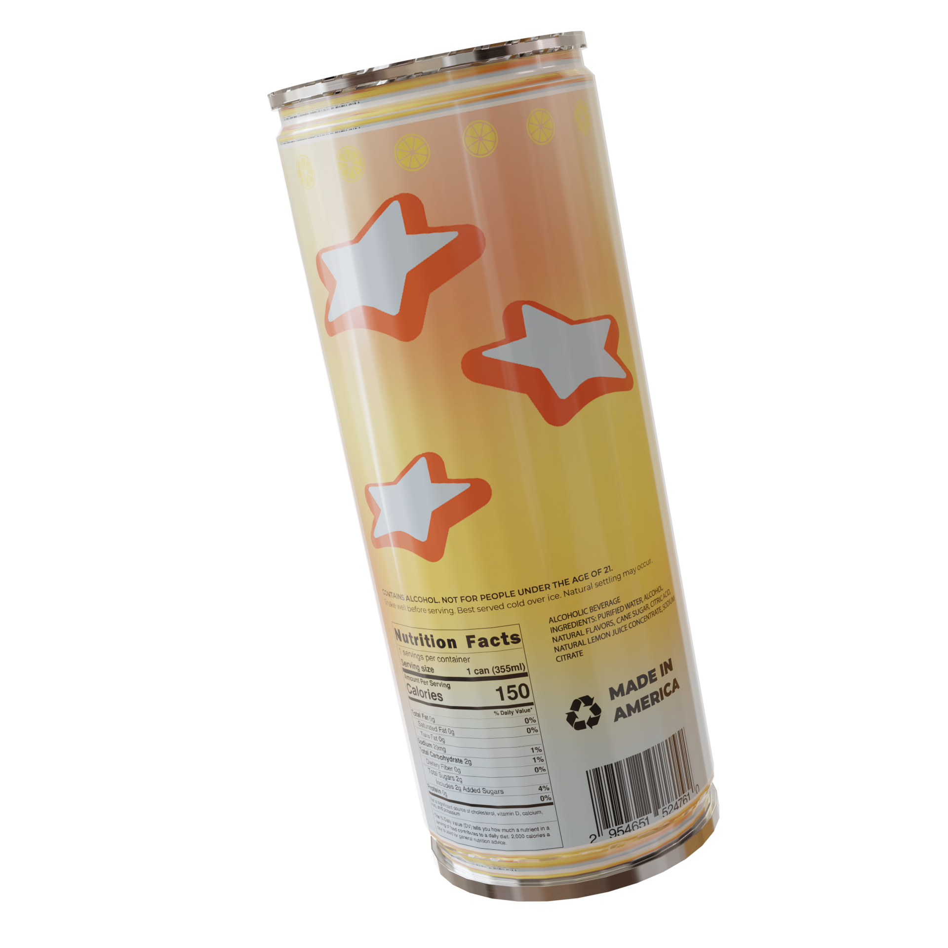
Typography carried that same intention. I leaned into sans-serifs that contrasted the logo for legibility. On the packaging, I applied these decisions to the full can label, balancing space so the logo stood out while wave-like patterns in the text and gradients created movement and atmosphere. Iconography also played a large role in the can label. Without knowing anything about the product, the Miami-inspired palm tells the whole story, accompanied with the logo's stars on the back.
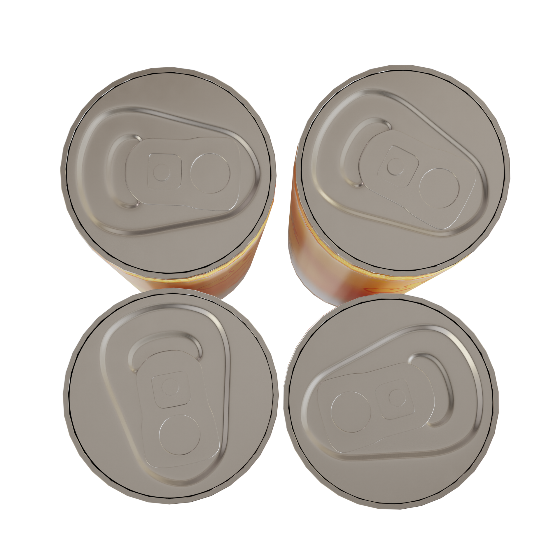
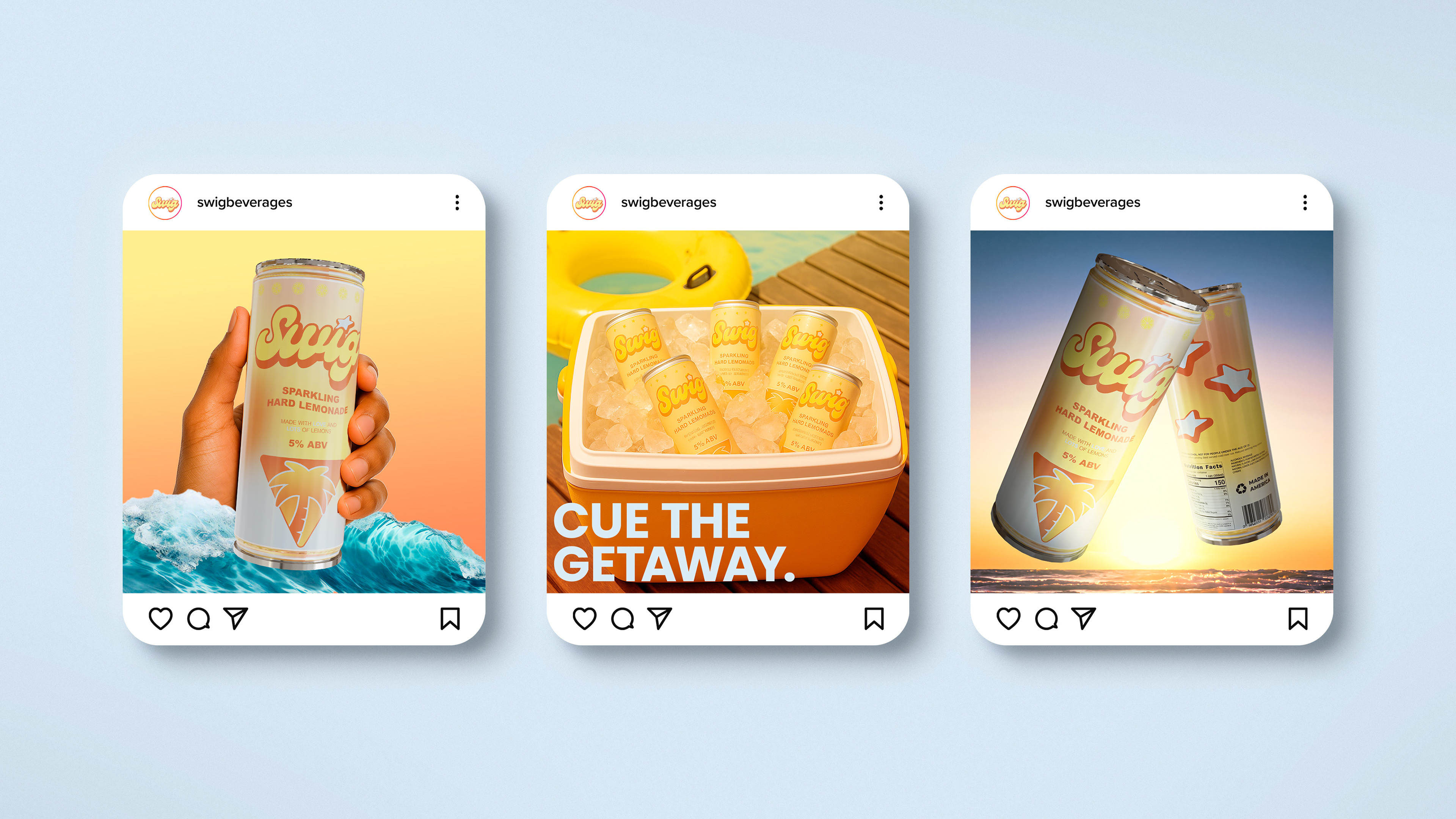
Because SWIG was a new product, I also built mockups and a 3D render of the can to simulate how it would look in real contexts. This included digital shelf views and test social posts, which helped ensure the brand held up both in physical packaging and online promotion.
The Results
The final design gave SWIG something it didn’t have before: a product that felt real. What began as an idea was transformed into packaging and visuals that looked shelf-ready, giving the brand immediate credibility. The can design resonated online, sparking stronger social engagement as people connected the look of the product with the lifestyle SWIG wanted to embody.
Instead of being seen as another startup beverage concept, SWIG now had a visual identity that could stand next to established competitors in the ready-to-drink space.
Beyond audience response, the project proved internally valuable. It became a launchpad for the brand’s marketing efforts, supplying not only packaging but also assets that worked across social and digital channels.
For me, the experience reinforced an important lesson: new skills can be learned under pressure. I had never modeled or rendered a 3D can before, but the need to deliver pushed me to learn quickly, solve problems as they appeared, and still produce work that elevated the brand.